Matte Dials vs. Sunburst Finishes: Which Custom Watch Face Trendy Colors and Finishes Win?
Why does a dial color change everything about a watch?
Only about 12% of watch buyers ever consider swapping a dial before purchasing. Yet among the Seiko modding community, the dial is almost always the first component replaced. That gap says something fundamental about how we underestimate surface aesthetics until we actually live with a watch on the wrist for a few weeks.
A dial is not decorative noise. It is the primary visual anchor of any timepiece, and its color, texture, and finish determine how the watch reads in different lighting conditions, against different skin tones, and alongside different wardrobes. When someone commits to a custom watch face, they are not just picking a color from a swatch card. They are choosing how light will behave on their wrist from morning commute to candlelit dinner.
The conversation around custom watch face trendy colors and finishes has matured considerably. Early modding culture was dominated by black and white dials with bold lume plots. The current wave is far more nuanced, pulling from furniture design, fashion runways, and even architectural materials.
What makes a color genuinely trendy rather than just popular?
Popularity and trendiness are not the same thing. A color can be popular because it is safe, navy blue being the obvious example. Trendy implies that the color is moving, that it carries cultural momentum and a sense of timing.
In the custom dial space, the colors generating the most energy right now cluster around two distinct poles. On one side sit the deep, saturated tones: forest greens with a slight olive undertone, burgundy shades that read almost brown in shade and vivid red under direct light, and a particularly striking category of slate blues that shift toward purple depending on the angle. On the other side sits a quieter palette of desaturated, almost chalky tones: warm off-whites, dusty sage, and a sandy beige that references vintage tropical dials without copying them directly.
Both directions reflect a broader cultural fatigue with pure, clean primaries. Watches with a straightforward red or royal blue dial feel dated in a way they did not five years ago. The market has developed a preference for colors that reward attention, colors that look different on a cloudy afternoon than they do under fluorescent office lighting.
How do different finishes interact with color choices?
This is where the real craft lives. A finish is not just a texture applied over a color. It fundamentally transforms how that color is perceived, and the wrong pairing can make an otherwise excellent dial feel cheap or visually incoherent.
Sunburst finishing remains one of the most technically demanding and visually rewarding options available. The technique involves brushing the dial radially from a central point, creating a pattern that catches light differently depending on the viewing angle. A forest green sunburst dial will appear almost black in low light and then bloom into a rich, almost iridescent green when hit by direct sun. This dynamism is precisely what makes it compelling. It means the watch never looks exactly the same twice.

Matte finishing operates on the opposite principle. Rather than playing with light, it absorbs it. Matte dials read as flat and graphic, which gives them a contemporary, almost industrial quality. The trade-off is that matte surfaces can look austere or even cheap if the base color is not carefully chosen. Matte works best with colors that have enough intrinsic warmth or depth to carry the absence of sheen: deep terracotta, slate gray, or the kind of warm charcoal that sits between black and brown.
Gradient dials, sometimes called fumé dials in traditional Swiss terminology, have migrated from high-end dress watches into the modding community with surprising speed. A fumé finish transitions from a dark, almost opaque center toward a translucent outer edge, allowing the movement or a contrasting sub-layer to show through. The effect adds depth without complexity, and it pairs particularly well with the current preference for copper and bronze tones.
What about textured surfaces beyond standard brushing?
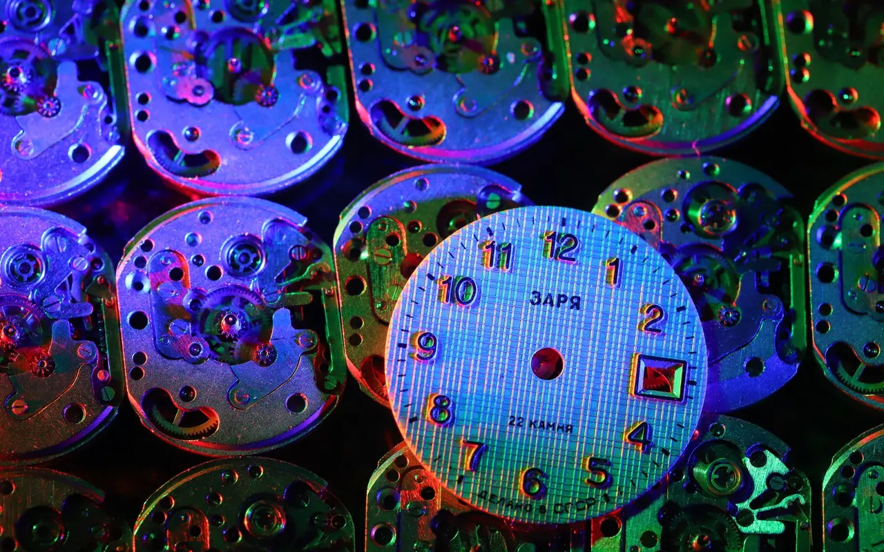
Beyond the classical finishing techniques, a category of structurally textured dials has been gaining traction. These include dials with a visible grain inspired by natural stone, waffle or crosshatch patterns machined directly into the brass or aluminum blank, and a newer category of dials that mimic the look of washi paper or raw concrete.
The appeal is tactile even when you cannot touch the dial. A texture creates micro-shadows that shift with light, giving the dial a three-dimensional quality that flat printing simply cannot replicate. For anyone building a truly unique piece, texture is often the element that separates a thoughtful build from a parts assembly.
Does the case finish need to match the dial?
Conventional wisdom says yes, and conventional wisdom is mostly wrong here. The idea that a brushed dial demands a brushed case, or that a polished bezel requires a polished dial, comes from a classical watchmaking tradition that prized visual harmony above all else. That tradition produced beautiful watches. It also produced a lot of safe, predictable ones.
The more interesting approach, and the one increasingly common among serious modders, is deliberate contrast. A matte olive dial against a high-polish stainless case creates a tension that reads as intentional. A sunburst copper dial inside a fully brushed case gives the copper warmth a kind of restraint it would not have in a fully polished environment. The key word is deliberate. Random mismatches look accidental. Considered mismatches look like design decisions, because they are.
Hand color and lume color are part of this equation too. Rose gold hands on a slate blue dial with cream lume plots is a combination that would have seemed jarring a decade ago. Now it reads as cohesive because the overall visual language of watches has expanded enough to accommodate it.
Why does the choice of finish affect long-term satisfaction more than color?
Color preferences shift. What feels exciting in the first month of wearing a watch sometimes feels loud or distracting by the end of the year. Finish tends to be more stable in its appeal because it is tied to how the watch behaves rather than just how it looks in a photograph.
A sunburst dial owner gets a different watch in every lighting condition. That variability tends to sustain interest over time. A matte dial owner gets consistency and graphic clarity, which suits certain personalities and certain wardrobes very well. Neither is objectively superior. But understanding which relationship you want with your watch before committing to a custom watch face trendy colors and finishes combination will save considerable regret.
The modding community has developed a useful shorthand for this: if you love a dial in photos but feel neutral about it in hand, trust the in-hand reaction. Photography flattens and saturates. Your wrist is the actual context.
Finally, consider longevity in a practical sense. Some of the more experimental coatings applied to custom dials, particularly certain PVD color treatments, can wear unevenly over time. Asking suppliers directly about coating durability before committing to a build is not overcaution. It is the difference between a watch that ages gracefully and one that just ages.