Choosing a custom watch dial when you want something no one else is wearing
Custom watch dials are not a niche obsession anymore. They sit at the intersection of craft, identity, and genuine horological knowledge. Understanding custom watch dials styles and materials is what separates a thoughtful build from a random parts swap.
Myth: any dial fits any watch movement
This is one of the most persistent misunderstandings in the modding community, and it costs people real money. A dial is not a universal component. The feet spacing, the thickness, the stem cutout position, and the chapter ring diameter all vary between calibers. A dial made for a Seiko NH35 will not drop cleanly into a case designed around a Miyota 8215 without some form of modification.
Beyond mechanical fit, there is also the question of dial-to-crystal clearance. Dome crystals in particular eat into the available space above the dial surface. If you are using a domed sapphire over a thick lacquered or layered dial, you can end up with contact marks that ruin both pieces. Measure twice, order once.
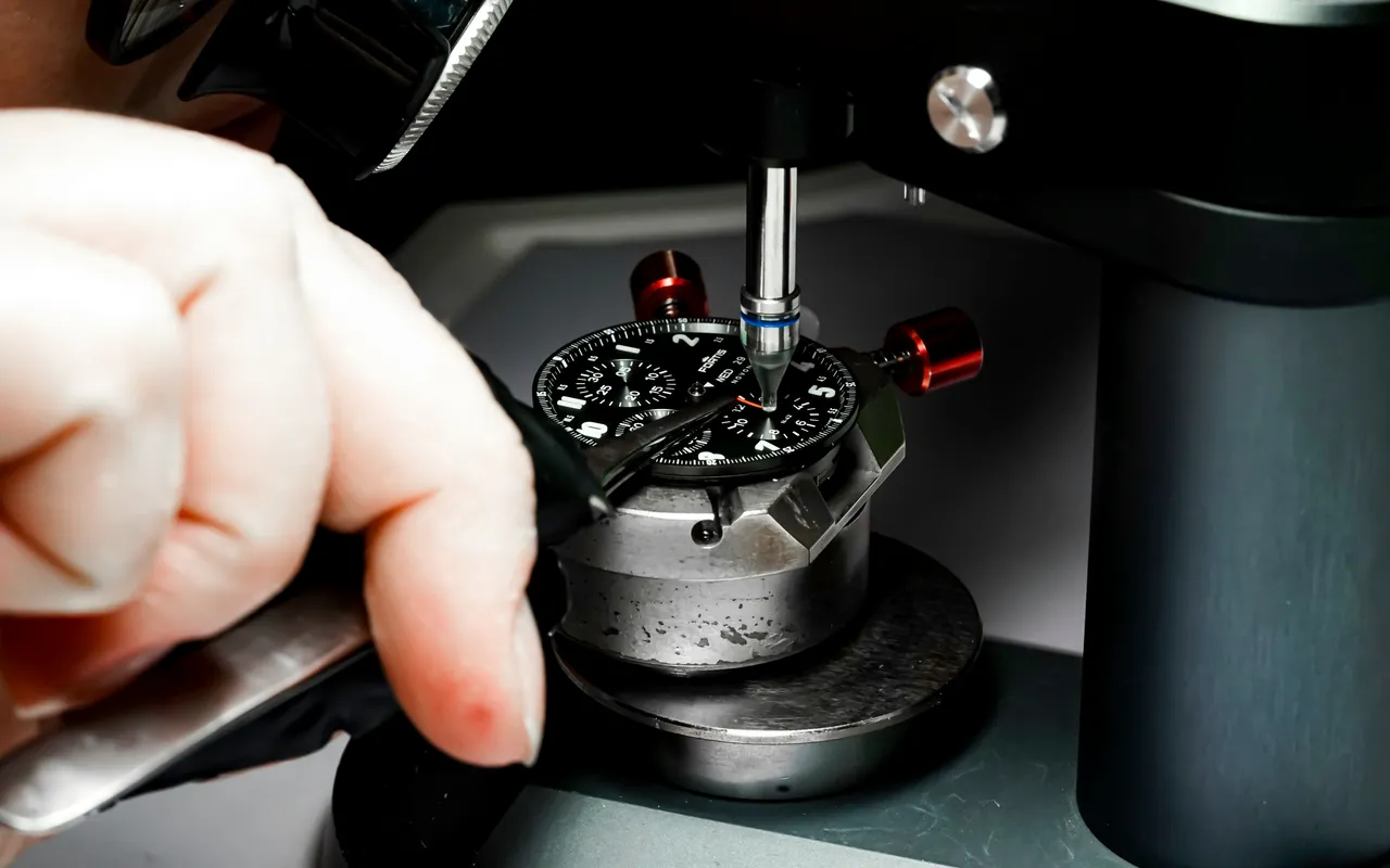
The good news is that most reputable suppliers now list compatibility data clearly. Cross-referencing that data with your case spec sheet takes ten minutes and prevents weeks of frustration. This is especially true for Seiko mod builds, where the aftermarket parts ecosystem is vast but not always standardized.
Myth: the material is just an aesthetic choice
Material determines far more than how a watch dial looks on a wrist. It governs durability, weight distribution, how indices adhere, how lume sits, and how the dial ages over time. Brass is the traditional base for most dials because it machines predictably, accepts galvanic treatments well, and provides a stable surface for printing or lacquering. But brass is heavy relative to its surface area, which matters when you are building a lightweight field watch.
Aluminum dials are lighter and take anodizing beautifully, producing that flat matte color you see on tool-watch-inspired builds. The trade-off is that aluminum is softer. Applied indices can loosen more easily, and the surface scratches if a tool slips during assembly. Carbon fiber dials look striking and are genuinely light, but they are brittle at thin cross-sections and the layered texture can make text printing inconsistent.
Enamel dials occupy a category of their own. Grand Seiko and independent Swiss houses have long used fired enamel for its depth and luminosity. For custom builds, enamel dials are available from specialty workshops, but they require careful handling. The vitreous surface chips under impact, and the dial feet are typically fused rather than soldered, which limits post-purchase modification.
Mother-of-pearl is another material worth understanding. It is cut from mollusk shells, which means no two pieces are identical. The iridescent surface shifts color under different light sources, and because it is a natural material, thickness varies slightly from blank to blank. Fitting a mother-of-pearl dial into a tight case requires patience and sometimes light shimming.
Myth: printed dials are inferior to applied ones
This comes up constantly, and it reflects a bias that does not always hold up under scrutiny. Applied indices, those small metal markers soldered or pressed onto the dial surface, do create a three-dimensional quality that photographs well and catches light dynamically. They are also the standard on most mid-range to high-end production watches, which is partly why people associate them with quality.
Printed dials, however, are not a budget compromise. Pad printing and screen printing can achieve resolution and color accuracy that applied markers simply cannot. Some of the most visually complex dial designs in the custom space use multi-layer printing to create depth, texture gradients, and color transitions that would be physically impossible with applied components. The process requires precision registration between layers, and when done well, the result is unmistakably intentional.
For Seiko mods specifically, the range of printed and applied dial options available today covers almost every aesthetic from military field dials to high-contrast dress designs. Knowing which process suits your design intent matters more than defaulting to one format because of perceived prestige. Custom watch dials styles and materials each carry their own logic, and printed execution at a high level is every bit as valid as applied work.
Myth: sunburst and gradient dials are all the same
A sunburst finish is created by brushing the dial surface radially from a center point before lacquering. The result is a finish that shifts between light and dark as the watch moves, giving the dial a sense of depth and motion. Not all sunburst dials are executed with the same care. The density of the brushing lines, the evenness of the radial pattern, and the number of lacquer coats applied over the top all affect the final character of the piece.
Gradient dials, sometimes called fumé dials, use a color that transitions from dark at the center or edges to lighter toward the opposite pole. This is typically achieved through controlled spraying of translucent lacquer. The gradient on a high-quality dial is smooth and continuous. On a lower-quality piece, you can see banding where the spray passes overlapped unevenly. When you are evaluating these dials, look at the transition zone under natural light, not just in product photography.
Both finishes work across a wide range of case metals, but they read differently depending on the case color. A blue fumé dial in a steel case reads cool and contemporary. The same dial in a gold-tone case shifts into a more vintage register. These are the kinds of pairing decisions that define a build's personality, and they apply whether you are working on an automatic watch or a quartz-based personalized watch project.
Myth: lume is just a practical feature, not a design element
Lume has crossed fully into design territory. The choice between standard C3 Super-LumiNova, BGW9 (the blue-white variant), and more exotic options like strontium aluminate compounds changes not only how a watch performs in the dark but how it reads in daylight. BGW9 has a slightly bluish-white tone in ambient light that suits gray or silver dials. C3 reads more yellowish-green, which pairs naturally with vintage-inspired cream or aged lume aesthetics.
Lume plots can also be shaped to carry design intent. Round plots are classic. Rectangular plots read more modern and tool-oriented. Some custom dial makers offer asymmetric lume arrangements or use lume as a structural graphic element, filling entire sub-dials or text fields. Lume fill consistency is one of the harder quality markers to assess from photos alone. Request macro images or ask for video under UV light before committing to a dial you have not handled.
The thickness of the lume application also interacts with your crystal choice. A thick lume plot on a flat crystal is fine. On a box crystal with tight clearance at the edges, that same dial can create contact issues that only appear after assembly. This is a detail that separates builders who have assembled a few watches from those who have assembled many.
Myth: texture and finishing details are secondary concerns
The surface treatment of a dial does more work than most builders initially realize. A grained or guilloché pattern, even a subtle one, changes how the dial interacts with ambient light throughout the day. Engine-turned patterns were historically cut by hand on rose engines, and while CNC has made similar textures more accessible, the depth and irregularity of hand-cut work remains visually distinct. For personalized watches, a textured dial is often the single element that makes a build feel considered rather than assembled.
Matte versus glossy lacquer is another decision that carries real consequences. A high-gloss lacquer over a sunburst base amplifies the light play but also shows fingerprints and micro-scratches more readily. A matte finish is more forgiving in daily use and tends to photograph less dramatically but wear more gracefully. Neither is objectively better. The right choice depends on how the watch will actually be used.
Case material and dial finish should be treated as a conversation, not independent decisions. A brushed steel case with a high-polish dial creates a deliberate tension that some builders use intentionally. A fully polished case paired with a matte dial does the opposite. Getting these relationships right is part of what makes custom watch dials styles and materials such a rich subject for anyone serious about building.
Myth: all custom dials are made for enthusiasts who want something flashy
This misreads the community entirely. A large portion of custom dial work is driven by people who want something quieter, more personal, and more considered than what production watches offer. That might mean a clean white dial with no date window, because the date complication was the only thing preventing a perfect build. It might mean a matte black dial with no lume at all, because the watch is worn in contexts where night visibility is irrelevant and the owner prefers a flat, graphic look.
The most interesting builds are often the most restrained. A single applied index at twelve, no text on the dial face, a seconds hand that matches the case metal exactly. These choices require more confidence and more knowledge than simply stacking features. They also age better, because they are not chasing a trend that will look dated in three seasons.
Custom watch dials styles and materials ultimately serve one function: making a timepiece that reflects a specific point of view. Whether that point of view is technical, aesthetic, or sentimental, the dial is where it becomes visible. Getting the material, finish, and construction right is not about perfection for its own sake. It is about building something that holds up to daily scrutiny, including your own.